With digital standards changing constantly and every client who knows their stuff wanting future proofed results, the holy grail of web design – a site which will serve all ‘channel’ requirements in one hit – finally seems to be upon us. So much so that it’s been listed as #2 in the Top Web Design Trends for 2012 by .net magazine.
In plain speak I’m talking about a site which will work on any monitor size, on any device, on any connection speed… at any point in the foreseeable future. And look great while doing it.
Sounds like a big ask, and one which would take a big budget, or a bigger blag, to specify. In the not so distant past this was very much the case.
The first people to start offering a cost-efficient framework for building responsively were, in my knowledge, Less framework. But this still required some pretty heavy integration – not to mention a very skilled designer able to navigate the different grid structures required in the setup.
As in so many things online it wasn’t long before the thinking behind this way of working started to percolate through the open source development community. The results are some of the most exciting steps forward in this medium at the current time. While much of the web has IMHO suffered a huge step backwards in recent years (at least as a truly creative place to work, at most as a stimulating place to visit) the new challenges created by multi-platform sites are making things really interesting for designers again. While html5 gradually plays catch up with Flash and many designers rehash ideas which were old ten years ago (in a new codebase!) a new design aesthetic and usability paradigm seems to be emerging.
As ever you need look no further than WordPress to see some great examples of this in action. Themes are starting to arrive with built in responsiveness, meaning that for $45 you can buy in the kind of platform that would have cost thousands to develop not so long ago, reskin it however you like, and deliver a site which ticks that ‘future proof’ requirement in the specification.
Whether this puts a dent in the app development and .mobi/ m. markets as many are predicting remains to be seen, but it’s hard to see how cash strapped clients can resist the temptation of killing five birds with one stone – delivering content that works on desktops, iPads, iPhones, Androids and Android tablets without the need for costly reversioning. There’s a great article on Smashing Magazine which compares the Obama/ Romney campaign site strategies, the former responsive and the latter reversioned and degraded (but of course!).
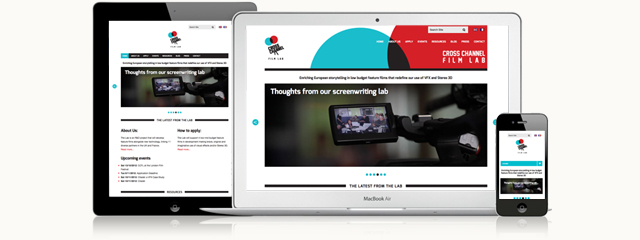
And yeah, you guessed it, there’s a plug here. My recent attempts in this area have borne fruit with the Cross Channel Film Lab, it’s multi-language multi-channel multi-device action without costing multi-bucks. Combining branding developed in a student project with a purchased theme to produce a rich user experience whichever side of the Channel (or whichever channel) you happen to be on.
Check it out at www.crosschannelfilmlab.com. Squash your browser to see responsiveness in action.
